A map is created automatically after clustering. If you chose not to view the map at that time, you can see it by right clicking on the 205 Cluster Boundary in the Boundaries tab of the Project Window and selecting "Add to map".
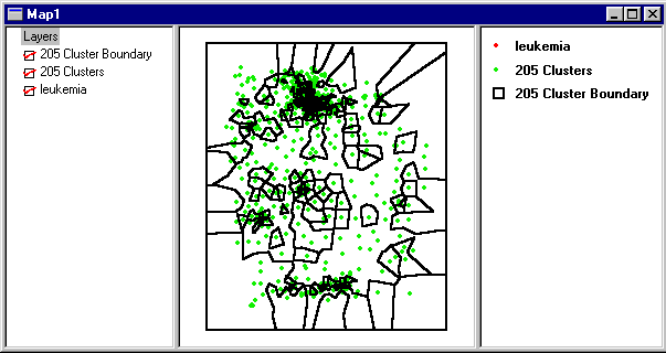
The map shows the 205 clusters in leukemia cases/1000 population. The red dots for the leukemia samples are completely obscured by the green cluster dataset dots. This is because a new dataset (205 Clusters) has been created with the same spatial coordinates. If you wish to view the original dataset, clear the 205 Clusters box in the layers pane of the map window.
The black lines describe the cluster boundaries, you will notice that there are a few clusters that enclose many points, and the rest of the clusters contain very few points. Cluster 8 contains 365 points, it is the middle cluster (shaped like a lumpy backwards C in the middle of the map).
![]() You can query clusters if you have the 205 Cluster Boundary layer selected (highlighted, you can select it by clicking on it with the pointer). Once you have selected that layer, choose the query tool from the map toolbar. Click on clusters to see information about each. You can also view this information in a table.
You can query clusters if you have the 205 Cluster Boundary layer selected (highlighted, you can select it by clicking on it with the pointer). Once you have selected that layer, choose the query tool from the map toolbar. Click on clusters to see information about each. You can also view this information in a table.
The answer to question 1 is YES, there is variation in the pattern of cases in these counties.
![]()