Choose "Plot" from the "View" menu to view the plot.
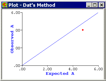
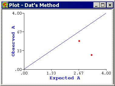
ClusterSeer will plot the observed statistic (A) on its expectation (E(A)) for a single and/or several time series. This plot describes where observations would be plotted under the null hypothesis of cases occurring at random over the t time periods. The time series are the red points on the graph. The blue line is the identity function (observed = expectation) describing where observations would be plotted under the null hypothesis. Under cluster avoidance A > E(A) and time series plot above the 45 degree line. When time clustering exists A < E(A), and time series plot below the line. Examine the session log for significance results.
![]()