


Principal Component Analysis Tutorial
Go to "Graph" at the top of the scatterplot, and select "Properties". Go to the Point fill properties tab and select "PCT_Blk". Choose Classified as your Color mode, Quantiles as the Classification Method, and 10 for Number of Classes. Then select a Color Palette that will clearly distinguish the different values. "Spectrum" is a good choice because the colors are very saturated. Click OK.
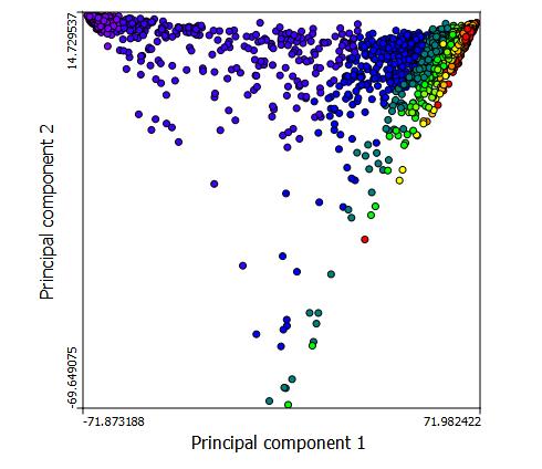
The bands of color reveal the internal structure of the data. The blue dots are the tracts with highest percentage of black population and red dots are the tracts with the lowest percent of black population. There seems to be a negative correlation between Prin comp 1 and princomp2 , until a threshold on the x axis is met, at which point the correlation becomes positive.
You can use PCA to examine a number of different variables. Just remember that the variables need to be similar in what they are measuring. In our example, we used different races. Similar options might be educational attainment groups, age groups, or income groups.
You have completed this tutorial!
PCA Visualizations and Sources:
http://ordination.okstate.edu/PCA.htm
http://www.uiweb.uidaho.edu/ag/statprog/sas/workshops/multivariate/princomp.pdf